Web Design Lookbook
Web design speaks in many visual languages. Some of them are precise and systematic, others expressive and emotional, but all shape how we experience the web.
Sites often blend, remix, or create entirely new directions. This lookbook highlights four selected styles and breaks down what makes each one work: the layouts, colors, typography, imagery, motion, and feeling that give each style its character.
Swiss Design
Communication made visible.
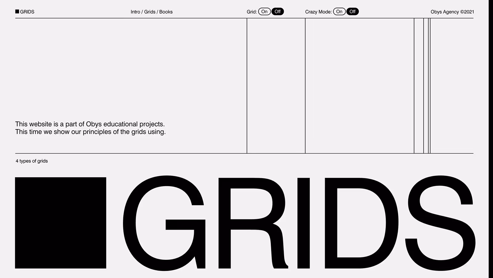
about Swiss Design is built on clarity, structure, and restraint. It uses grids to organize content, typography to create hierarchy, and white space to let ideas breathe. Every element has purpose, every decision aims for readability and balance.
Born from the International Typographic Style of the 1950s, it turned modernist discipline into visual language.
Grids guide the eye, margins create rhythm, and type delivers the message. The result is clean, rational, and quietly confident.
characteristics
Typography
Clean sans-serifs like Helvetica, Univers, or Neue Montreal. Hierarchical, consistent, and left-aligned.
Layout
Modular systems, balanced and structured with generous white space. Everything aligns to invisible guides.
Colors
Neutral base (white, gray, black) with measured accent colors. No gradients; color feels solid and purposeful.
Imagery
Precise and high-quality photography, geometric shapes, no decorative patterns. Images serve function.
Motion
Controlled, smooth, logical transitions with easings. No excess movement.
Tone
Objective, rational, modern, confident without aggression.
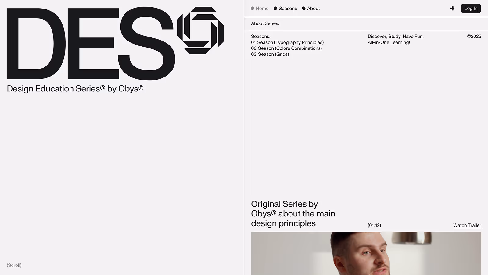
by Obys Agency
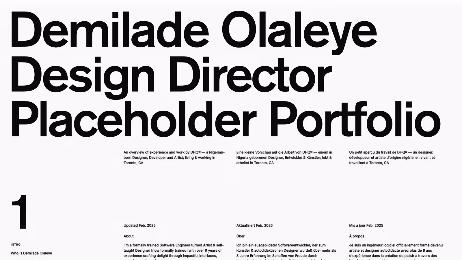
by Demilade Olaleye
why it worksIt doesn’t compete with content, it amplifies it. Swiss Design has survived decades of visual trends because it’s built on logic, not fashion. Perfect for when communication needs to feel timeless, balanced, and trustworthy.
The grid creates predictability. Typography establishes order. And generous white space gives room to breathe.
sub-styles
Editorial Swiss
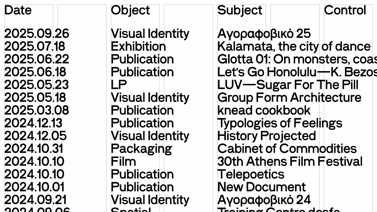
Text-dense layouts, multi-column grids, strong typographic hierarchy, content-first.
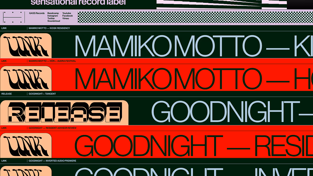
Swiss-Expressive
Rigid grid structure but color, motion, or interaction add personality.
Corporate Modernism
Practical and brand-focused, neutral in tone, functional and restrained.
Swiss-Minimalism
Reduced to typography and spacing, more restraint, maximal white space.
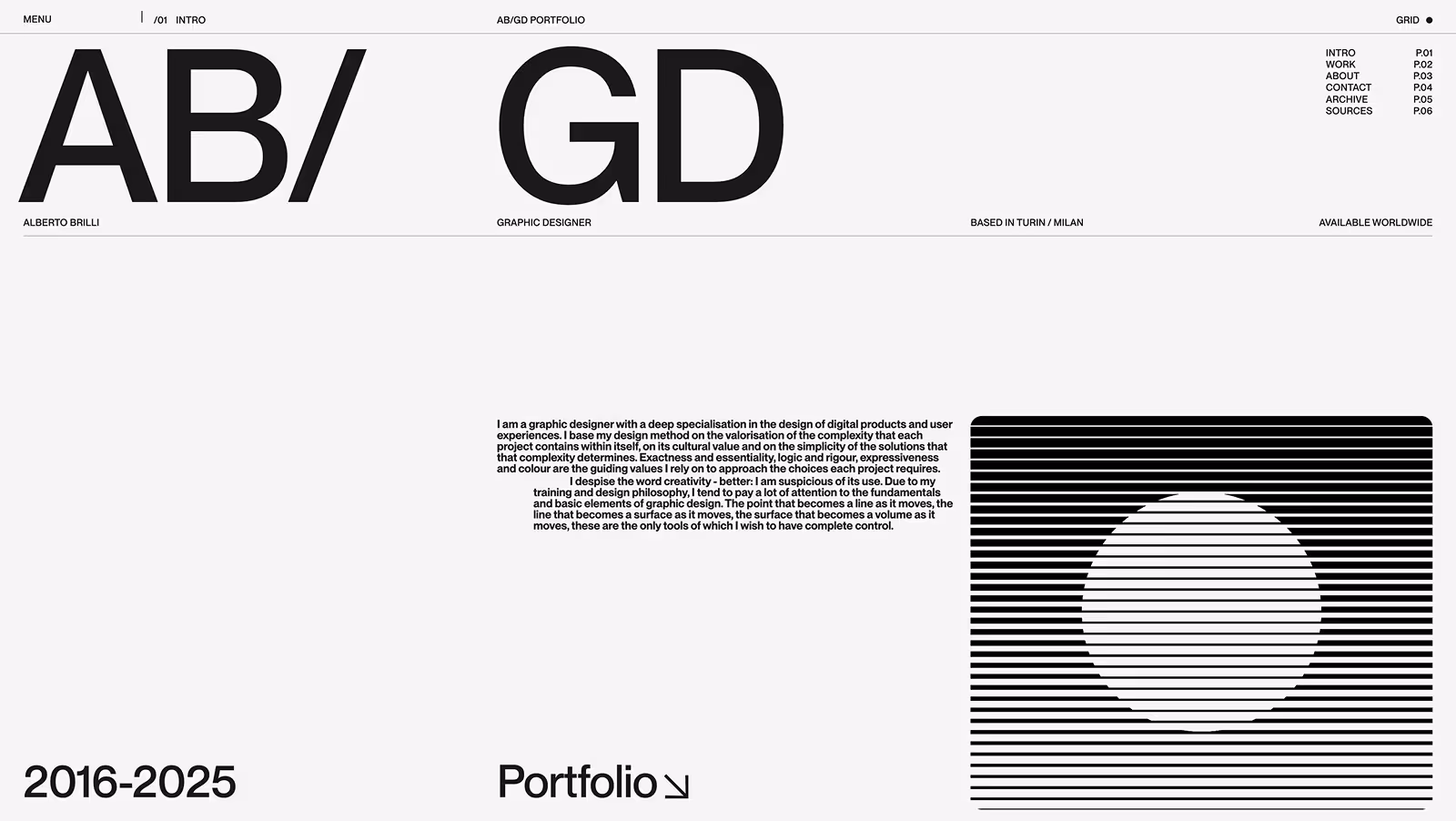
by Alberto Brilli
by Obys Agency
conclusion
Why it works
Because it doesn’t compete with content, it amplifies it. Swiss Design has survived decades of visual trends because it’s built on logic, not fashion.
Where it works
Corporate websites, educational institutions, editorial platforms, design studios, data dashboards, and brands that value precision.
The Paradox
Its restraint can feel cold or distant if overdone. Swiss design looks effortless, but it requires rigorous planning. Every margin, every line height, every grid column is intentional.
Design tip
Start with the grid and let typography carry the weight. If removing the grid breaks the layout, you’ve done it right. Swiss Design requires balance between function and rhythm.
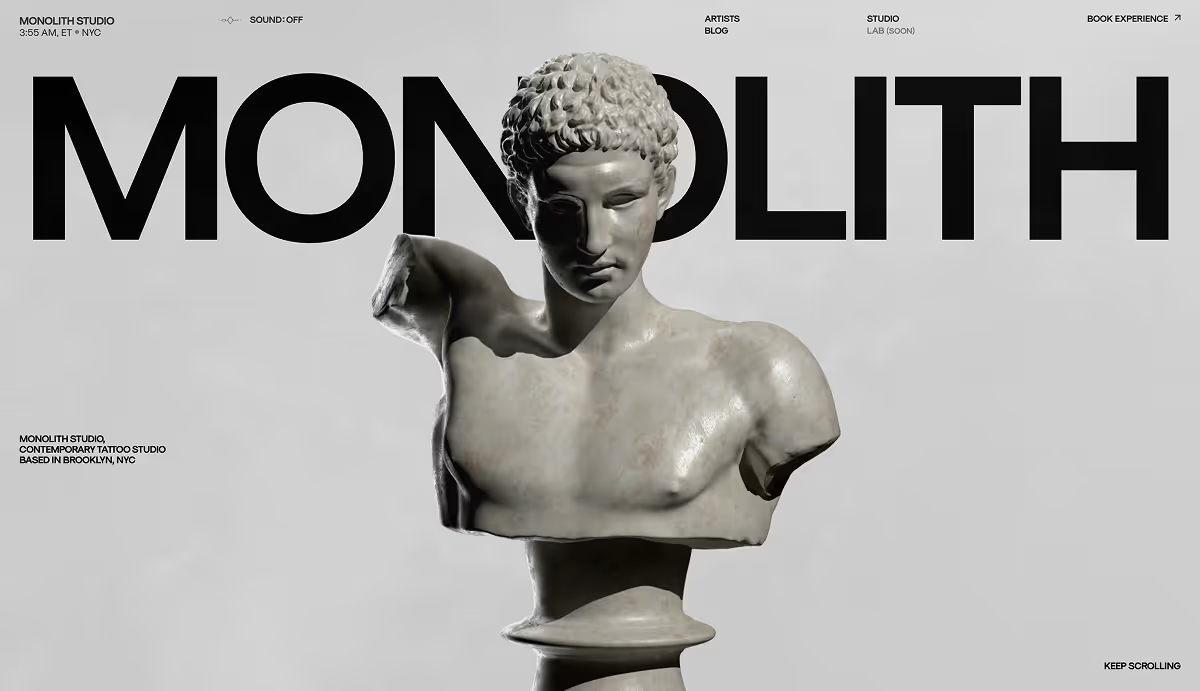
illustrative pop design
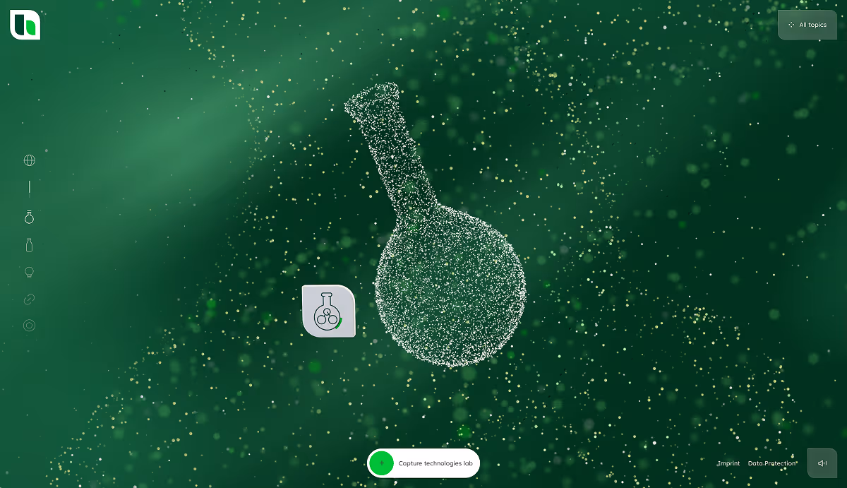
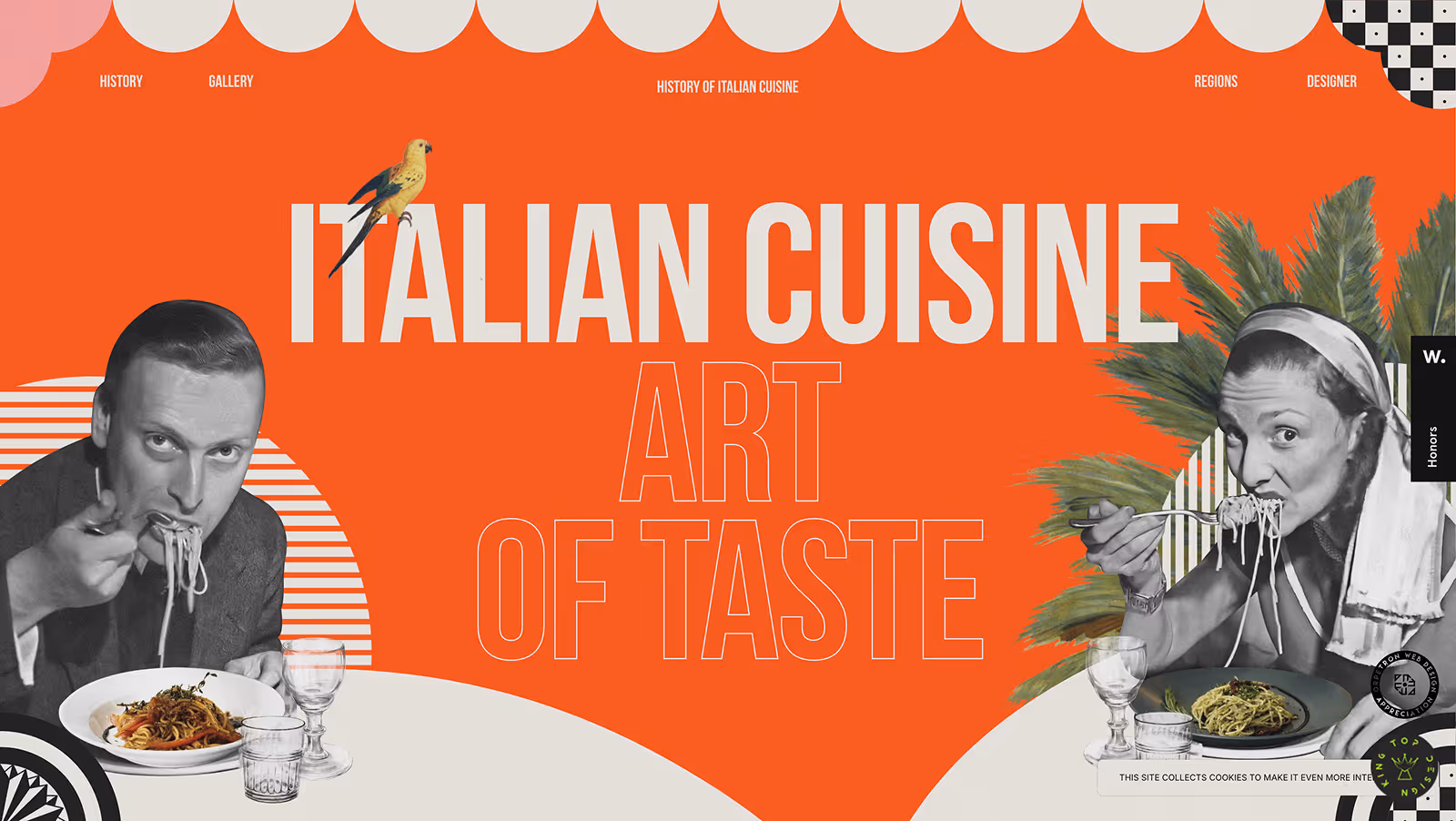
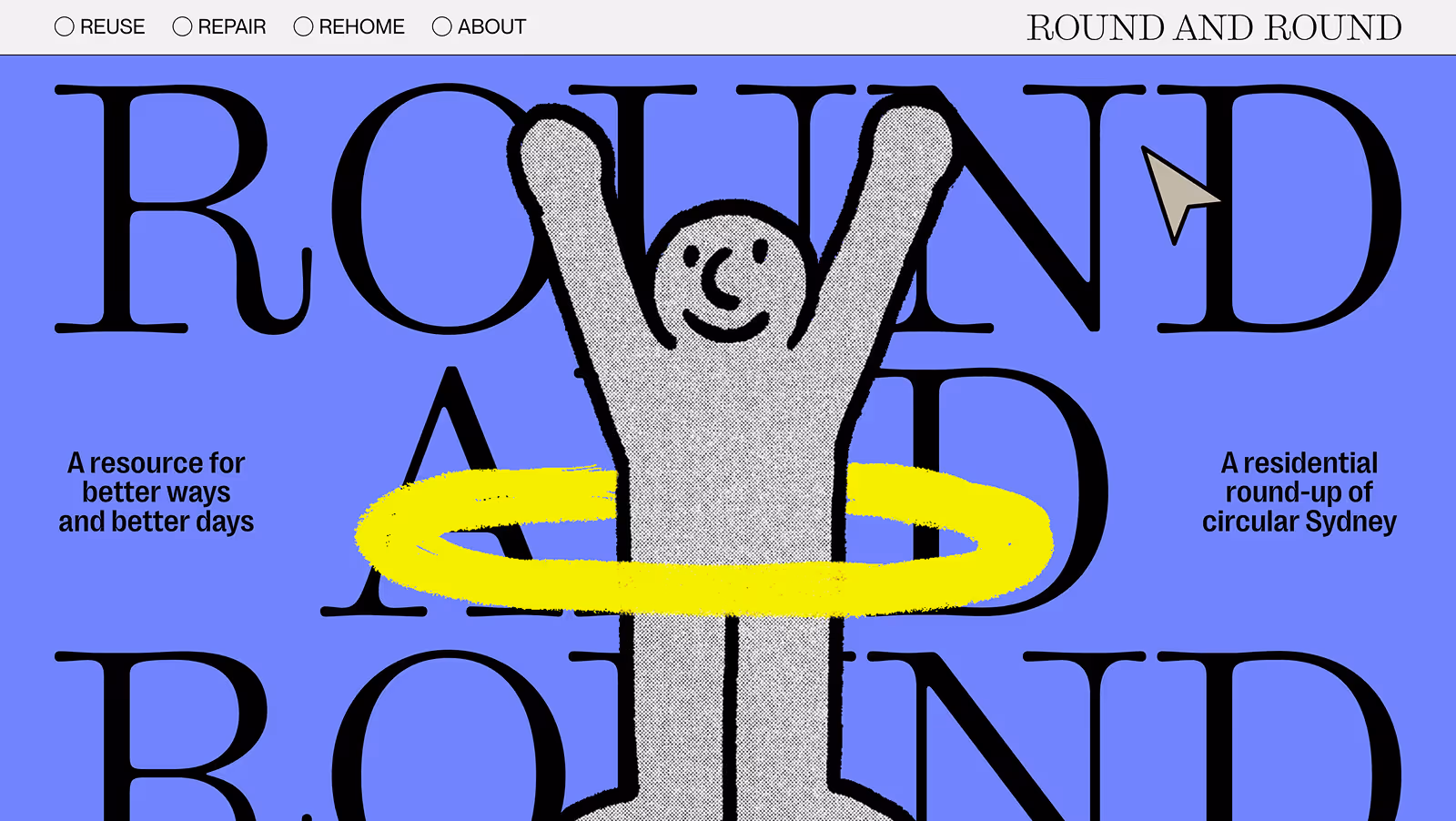
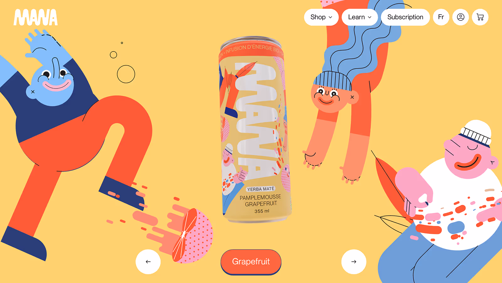
Illustrative Pop Design draws from pop art’s boldness and graphic design’s storytelling power. It prioritizes custom visuals, vibrant color, and energy over strict systems.
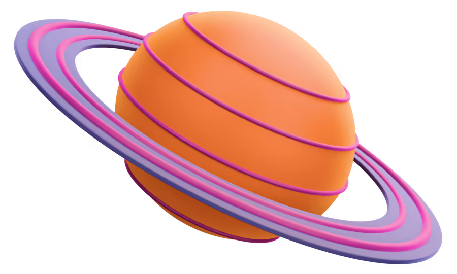
Instead of following rigid grids, it follows emotion, using illustration, layering, and motion to make websites feel alive and joyful.
In this guide, Illustrative Pop Design serves as an umbrella term for contemporary, art-driven aesthetics that mix illustration, color, and motion. It includes various approaches, what unites them is a belief that digital design can be both functional and emotional; structured yet full of life.

SUB-STYLES
2D Illustration Based
Characters, drawings, and scenes lead the visual story.
Maximalist Pop design
Bold typography, rich color, dense layouts, layered illustrations.
Organic Art Direction
Hand-drawn natural forms, organic shapes, flowing transitions.
Retro Pop / Y2K Revival
Nostalgic palettes, chrome or holographic details, pixel art, vibrant compositions.
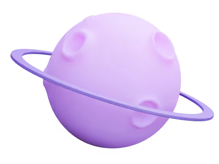
Playful 3D / Claymorphism
Soft, rounded shapes; tactile and toy-like visual tone.
why it works
Because emotion builds memory. Illustration and motion make design personal and relatable. In a digital world full of sameness, this style creates warmth and recognition, making brands feel relevant and approachable.
Where It Works
Creative studios, lifestyle brands, campaigns, entertainment, product storytelling, and youth-oriented platforms. Anywhere personality and cultural connection matter more than corporate neutrality.
The Paradox
Looks spontaneous but still needs structure. Behind every effortless curve or bouncing shape is strong composition and visual discipline. Without it, charm becomes clutter.
Design Tip
Lead with feeling, then refine with logic. Build emotion first, but have a consistent illustration style and let hierarchy and spacing keep the joy in balance.
03
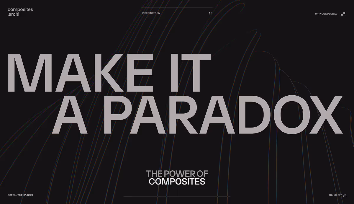
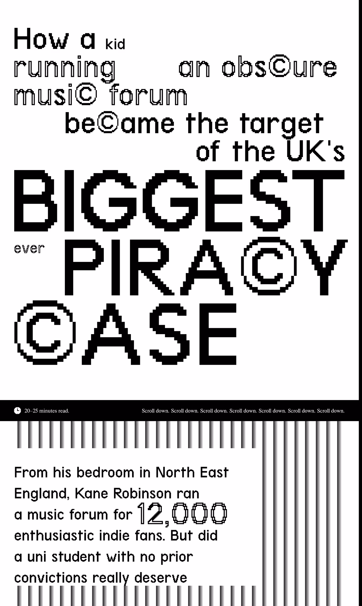
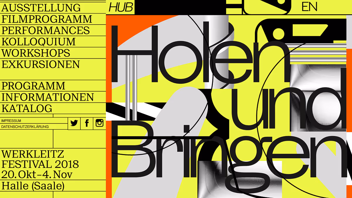
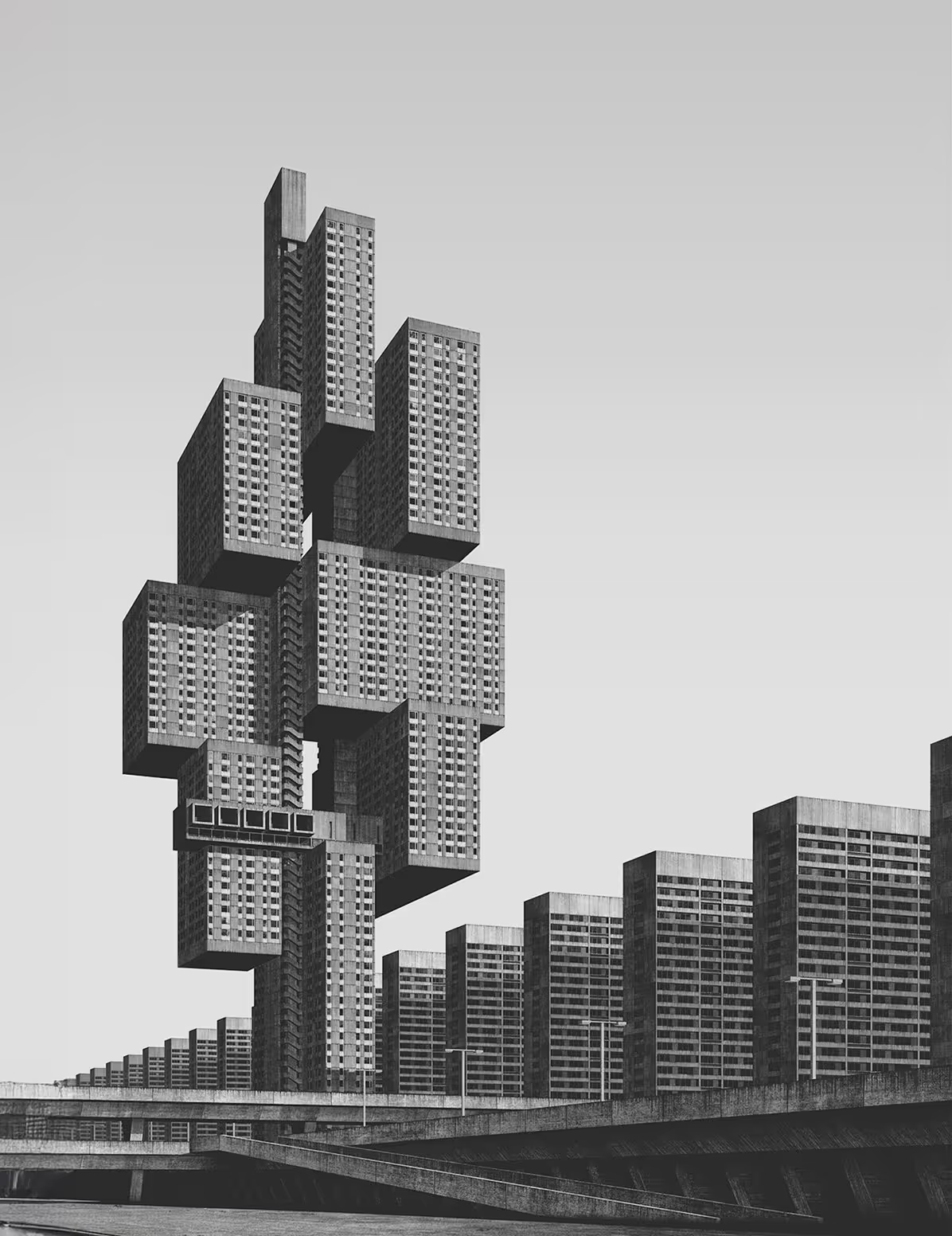
Brutalism
Brutalism in web design takes from brutalist architecture: raw, honest, structural. It breaks the rules on purpose and exposes the structure instead of hiding it. Grids, outlines, and plain elements become the design, not the background. There’s little decoration, no comfort. It’s the digital version of showing your work; embracing imperfection, rejecting polish, trusting that structure itself can be beautiful. What remains is bold, memorable, and unapologetically clear.
tension
characteristics

It says "I am confident enough to be ugly." Ideal when the goal is to make a statement, to feel different, direct, and unfiltered.
Typography
Layout
Imagery
Colors
Motion
Tone
examples
[SOME] SUB-STYLES
Classic Brutalism · Neo-Brutalism · Minimal Brutalism · Anti-Design · Glitch / Punk Brutalism · Cyber-Brutalism
Artists.
Developers.
Rebels.
Anyone who values honesty over comfort.
design tip
WHY IT WORKS
In a world of perfect gradients and smooth animations, brutalism stands out. It's memorable because it's different.
WHERE IT WORKS
Creative agencies, artist portfolios, developer sites, experimental projects, digital magazines, concept-driven studios.
THE PARADOX
Brutalism requires sophisticated design skill to look "unstyled." It's harder to make intentional chaos than polished order. Bad brutalism is just bad design; good brutalism is calculated rebellion.
Use restraint. The power of brutalism comes from honesty, not clutter. Every raw decision should feel intentional.
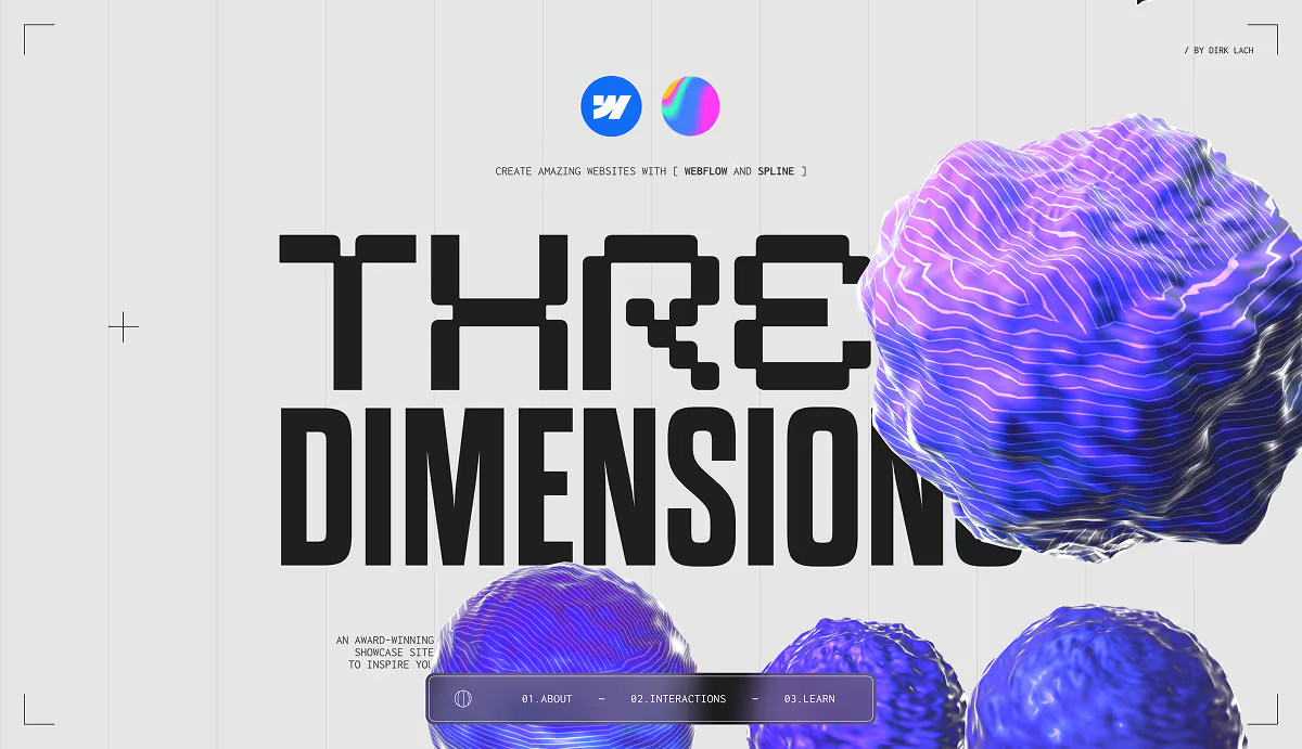
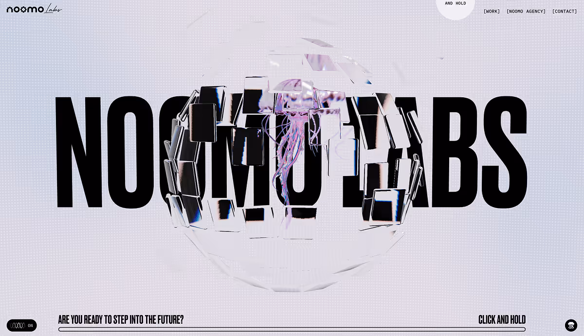
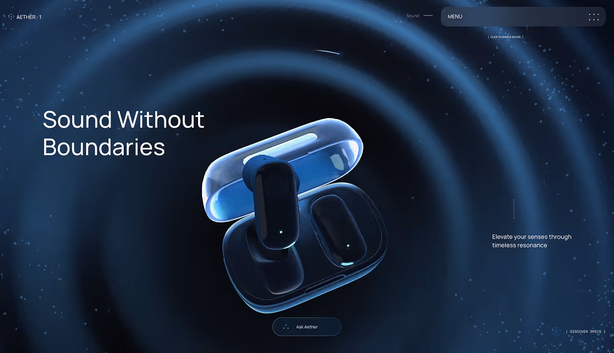
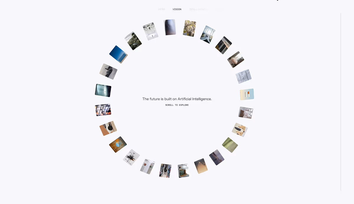
Immersive
Design
moves with you
Immersive Design transforms the screen from a flat surface into a spatial experience. It uses depth, light, and motion to create presence, turning layouts into environments that feel alive. Layers move, transitions guide flow, interaction adds rhythm.
This style uses motion and space as design tools. It guides users through scenes and stories with cinematic rhythm and sensory tone.
Characteristics
01
Typography
Clean, legible, and often secondary to the visual atmosphere; placement and motion add hierarchy.
Why It Works
Because it engages the senses. Immersive Design captures attention by making users feel present, not passive. It aims to create memorable experiences that differentiate brands.
Where it works
Immersive Design transforms the screen from a flat surface into a spatial experience. It uses depth, light, and motion to create presence, turning layouts into environments that feel alive. Layers move, transitions guide flow, interaction adds rhythm.
3D / WebGL Interfaces
Neumorphism
Glassmorphism
Cinematic Interfaces
The Paradox
Immersion requires subtlety. Too much depth or motion can distract or disorient. The best immersive experiences balance spectacle with clarity, guiding emotion without losing usability.
design tip
This style uses motion and space as design tools. It guides users through scenes and stories with cinematic rhythm and sensory tone, blurring the line between interface and experience.